By the time your iconic album covers for Jade Tree Records were in print, I’d already decided to become a graphic designer. As a teenager, I loved the concept of being in the art world yet was not the greatest hands-on artist. I lacked the depth of imagination present in those who make art for the sake of art, plus the practicality instilled in me as a child of working class parents didn’t allow me to entertain the notion. Put that in a jar with the inordinate amount of time I’d spent at a computer and shake—you’ve got a graphic designer.
My dream was to move to New York City, live/work in an impossibly large, bright, slightly disheveled studio space and art direct a magazine. (Weren’t we all at least a tiny bit inspired by Raygun back then?)
To make that happen, or so it seemed at the time, art school was a must. RISD was my top choice though self-doubt prevented me from even applying. (Talk about being your own worst enemy.) The Art Institute of Pittsburgh was less risky, less expensive and allowed me to return to my hometown for a couple years.
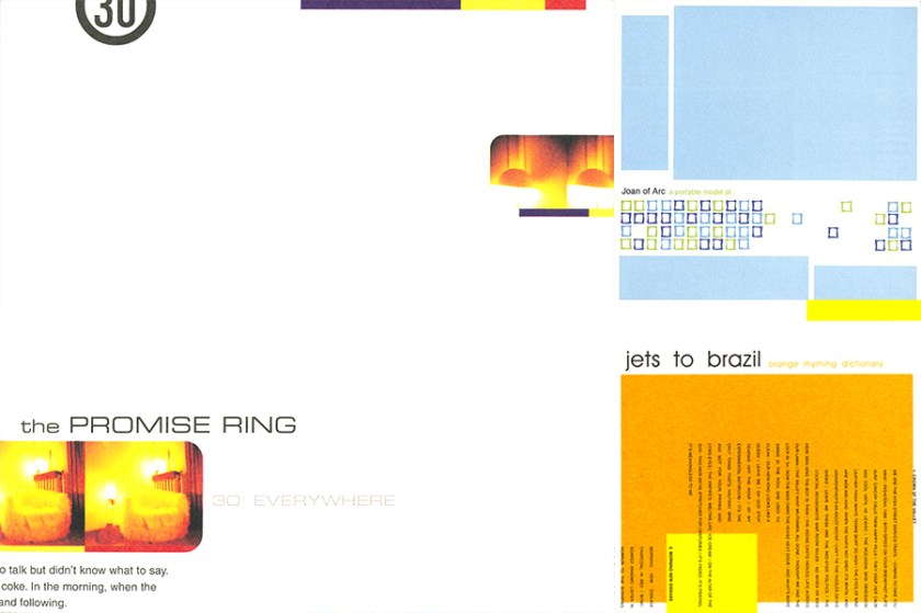
Truthfully, it didn’t matter much to me where I got started. I knew what to expect: me being relatively anti-social, listening to music, going to shows and learning design. Maybe, MAYBE, I’d make a couple friends through our mutual love of music, which is exactly how I found out about The Promise Ring. Someone told me they were fond of 30• Everywhere, and before I heard a single note, the album art reeled me in. It used color sparingly yet deliberately. It had WHITE SPACE on the cover. Clearly it was holding something back and I needed to know what it was, so I bought it.
On the first few listens, my focal points were “Everywhere in Denver” and “Red Paint.” I’d spent prior years predominantly listening to punk and uptempo indie, so the subtlety of something like “A Picture Postcard” was initially lost on me. Ever determined, I kept at it and over time the nuances of each song captured and held my attention.
Part of what kept me going back was the artwork. I was determined to make sense of something that looked so refined and beautiful. It sounds like I’m being overly dramatic, but I was at a fork in the road. Old self—high school student and stubborn malcontent—was part of this scene:
New self—aspiring to be a graphic designer with a good eye—wanted to be in this scene:
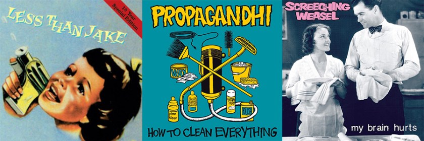
So I obsessively listened to 30• Everywhere followed closely by Nothing Feels Good and explored albums on different labels with similar aesthetics (and therefore, in my mind, a related sound).
It was like passing through a door I never knew existed; a turning point for which your design work and music were a critical catalyst. This was where I fit in, if not immediately than at least I finally knew where I wanted to be and with whom. I felt compelled to take my education to the next level and transferred to RISD with the help of a scholarship, where I used your style as inspiration for one of my first projects:
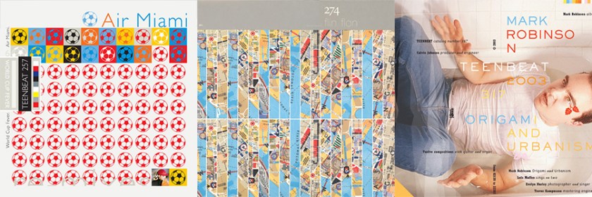
With broader knowledge of the music and design industries, this was not unlike the work of Peter Saville for Factory or Mark Robinson for Teen-Beat.
You too spearheaded the look and feel for a small music genre that touched fans on a very personal level. Whether they realized it or not, your aesthetics contributed greatly to the overall concept of their favorite music.
Thank you for inspiring me aurally and visually. My trajectory would have undoubtedly been different (and likely less interesting) without you.
Hugs,
Christine
RECOMMENDED LISTENING
Everywhere In Denver
Between Pacific Coasts
A Picture Postcard
